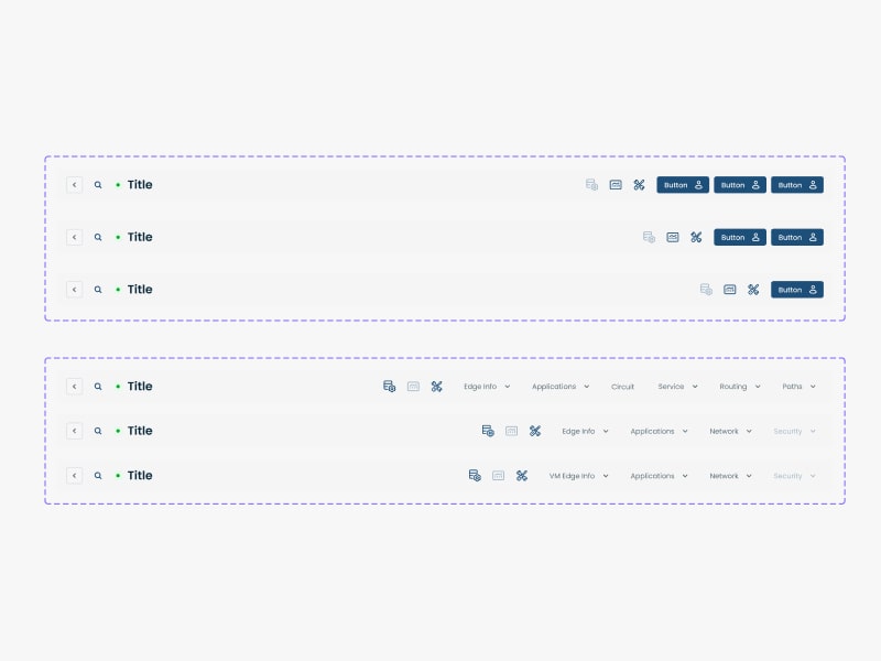
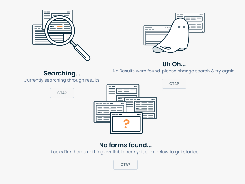
Design System - Case Study
 Graphiant Design System - A NaaS Company


About Graphiant
Graphiant is a Silicon Valley-based provider of next-generation Edge services.
MY role
I worked as a product designer working for the Design System & Monitoring Module

-
Role
Product Designer
-
Team
5 Designers
-
Timeline
6 Months
-
Tools
Figma
Project Overview
When I joined Graphiant, I had the opportunity to work for a Silicon Valley based start up which was in stealth mode and they were building the product.
My Process
- • Gathering already build components on website
- • Defining the Atoms (Colors / Typography / Grids/ Shadows)
- • Designing Molecules along with Variants
- • Adding micro-interactions and prototype where required
- • Testing the components
- • Preparing a usage document for devs and designer
- • Onboarding Team to Design System
Breaking Down Dependencies
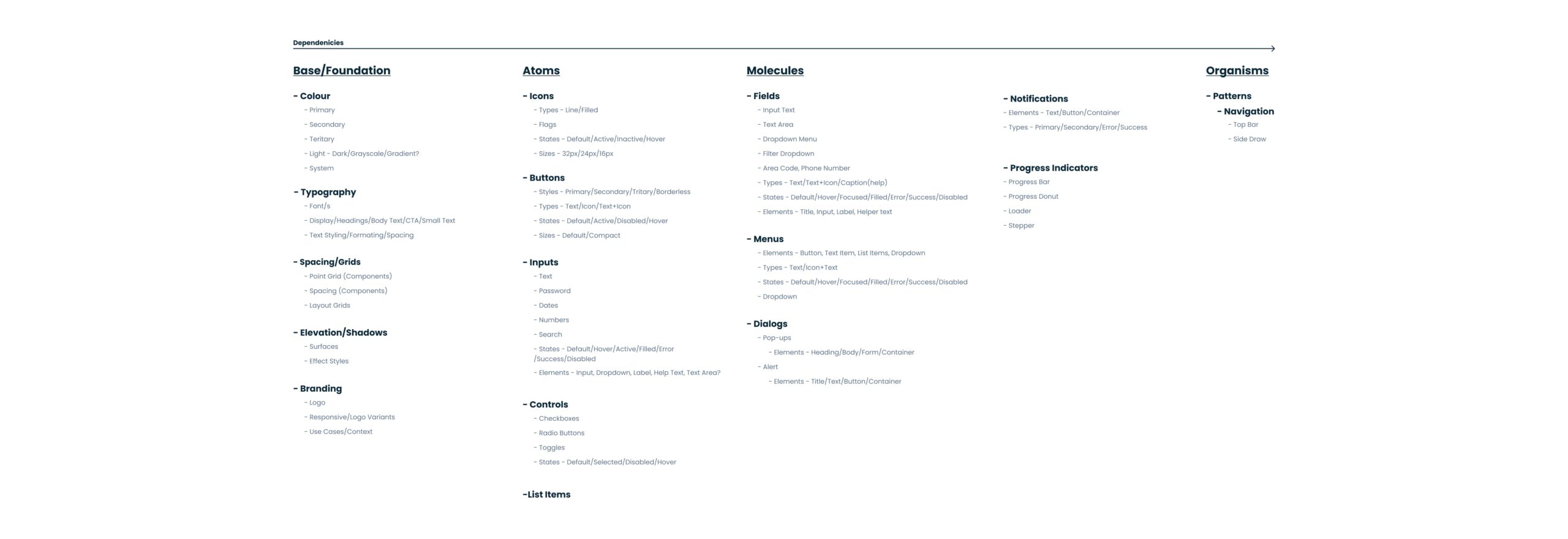
We started off by breaking down dependencies, In this way team can better understand the structure and interconnectedness of its elements, facilitating efficient design and development processes while ensuring consistency and scalability across the product.
Below is a glimpse of how we defined the base foundation, atoms, molecules and organisms.
Design System File Convention
The team decided that major components like Colors, Typography and Icons which are rarely updated should sit within its own file and rest comes in a Components File which we keep updating on regular need basis. The reason was most of the time, you’re working on one component at a time. If you put all the components in one file, it slows down Figma. By giving them its own file, it’s quicker to open and you have the whole history and documentation in one place.
Below is a representation, Icons, Typo and Colors has its own file in the design system along with rest of major components. This view shows the cover pages for of those files within the Design system.

Laying the foundation
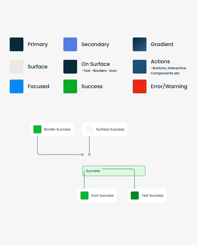
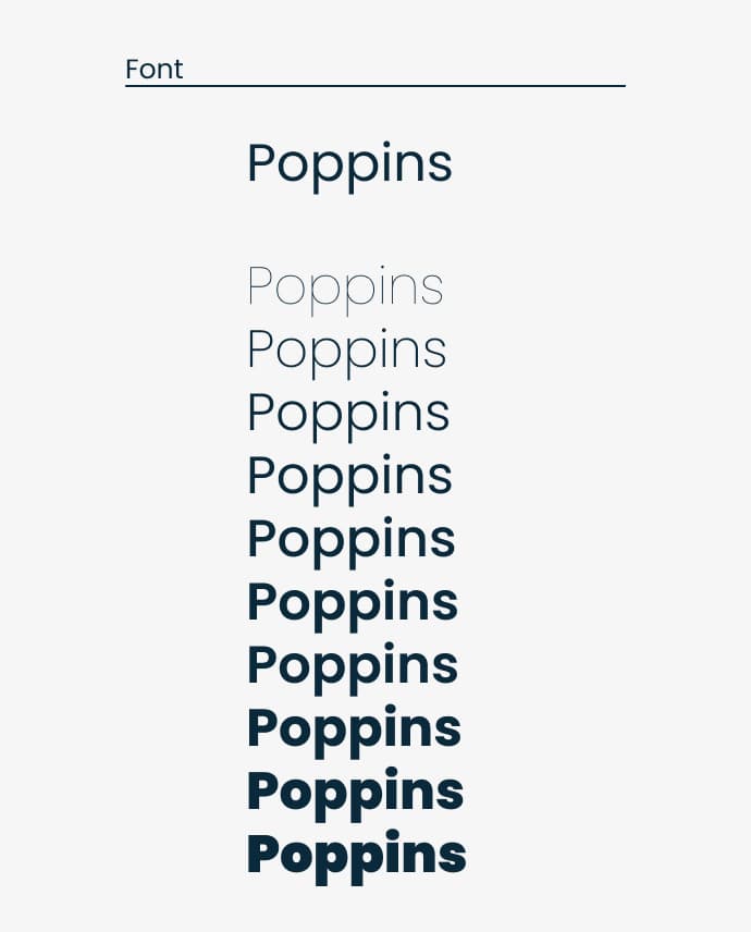
One of the first tasks was deciding on the typography and the colour palette. We presented a few options to the Leadership team, taking into account the nature of platform and the user.
We aligned on a a color palette and a font for the platform. Then defined the fonts for all screen sizes and color with all the states.
Building Components
The next step was getting started on an ever-developing set of components, guided by the Atomic Design approach. Continuously working with developers, we made sure that naming conventions and component organisation work for both sides: the Design System was mirrored in Storybook and a collaborative approach made the process more streamlined.
Accessibility baked into the process
Having the opportunity to build a Design System from scratch meant that accessibility became part of the process, rather than an afterthought.
Some of the key principles taken into account were:
- • Checking colour contrast on different background and across different interaction states (this included me going down a deep rabbit hole of accessibility standards for disabled buttons)
- • Ensuring font size + touch targets on mobile are appropriate
- • Consistency across layouts and similar UI elements
Developer Handover
While we had bi-weekly grooming meetings with the Product and the developers, there was not enough time to discuss all the interaction details. In a fully remote team, asynchronous communication is key.
Therefore, our handovers consisted of contextual notes in Figma files, video walkthroughs of specific interactions or more complex flows, visualisations of expected behaviours in static files. Furthermore, when new components were added to the library, I linked the screens to the set of components so developers always have access to the source of truth.
Below is a very detailed demo prototype .


