Product Design - Case Study
 Building a modern configurator to improve the sale


About MYCS
Mycs is a Berlin-based furniture company that offers customizable furniture solutions, and it's known for its online furniture configurator. The configurator is integrated with Mycs' e-commerce platform, enabling customers to seamlessly proceed to the purchase once they have finalized their customizations.
MY role
I worked as a team lead managing the whole ecommerce website and building of new modern furniture configurator. Along with me the team consists of a Junior designer, 2 content designers (FR,DE), 1 Project manager and a graphic designer.

-
Role
Lead Designer
-
Team
2 Product Designers - 8 Developers - 1 PM
-
Timeline
Ongoing
Project Overview
In this project we followed the Agile methodology coupled with Lean UX Approach. In this way we first worked on the whole ideation and build on top of it with incremental model.
What was the process in this
- Problem Identification
- Competitive Analysis
- Stakeholder Alignment
- Ideation
- Prototyping / UI Design
- Product Rollout and Testing
- Repeat the process with user feedback
What was the actual problem ?
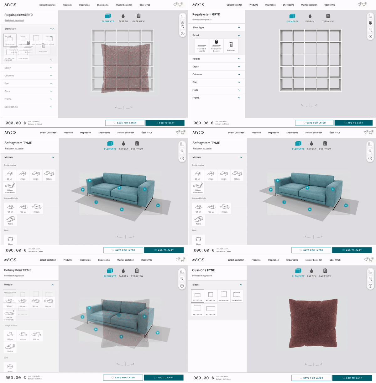
• In 2023, Mycs released a unified configurator for all furniture types.
• Previously, Mycs had separate configurators for different furniture types, causing significant tech debt.
• The team launched a single piece of code to handle the configurator for all furniture types.

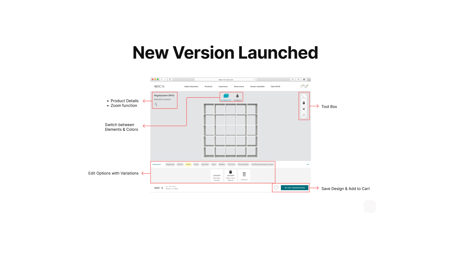
What happened after the launch
After the launch, there was a massive drop in customer engagement of configurator and hence the sales dropped. The stakeholders decided to revert back to the older version, so that there is no more loss of customers.
My task:
Identify the problem and Improve new configurator based on user feedback.
Business Needs:
Cost saving on the development of the new configurator.
Improving sales and customer retention through configurator.
User Needs:
Easy to use tool through which they can design the desired furniture.
Gathering the customer feedback
I started with user interviews to identify problem and figured out a few issues
- 1. Cognitive Load
- 2. Unconventional Page layout
- 3. Interface is confusing
- 4. User cant perceive the icon/ copy
- 5. A lot of Confirmation Step

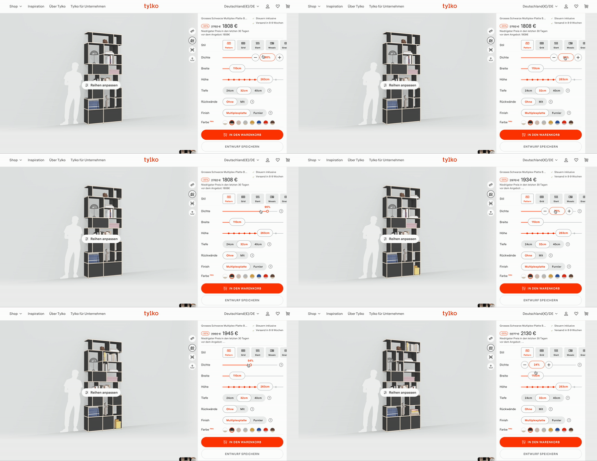
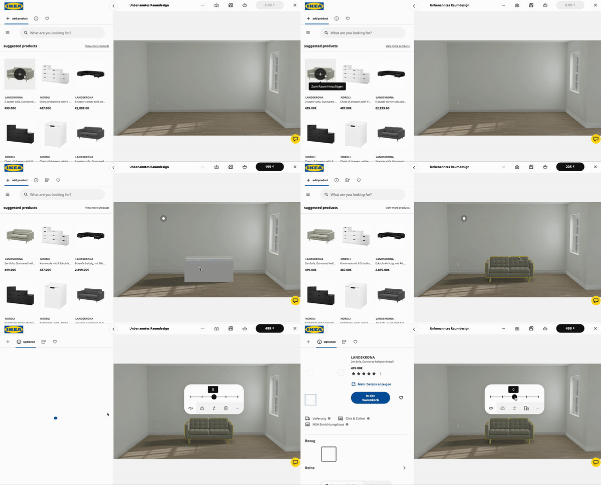
Looking at similar tools available
I started with user interviews to identify problem and figured out a few issues
- The 3 configurators have same layout which was missing in case of Mycs.
There is limited to no friction while testing out options. Mycs asks to confirm at every step.
Most of the options are self explanatory otherwise there is a help text which missing in case of Mycs.
Complex options are grouped together. Less cognitive load.
- The 3 configurators have same layout which was missing in case of Mycs.

Direction going further! Dev & PM Alignment
Can we follow the same layout and make our configurator similar to what other players are doing? How much dev effort is required?
How about we add an on-boarding and educate the customer beforehand?
Update the icons and UX copy which was misleading.
Can we introduce a video tutorial? Is it beneficial
Can we skip the confirmation step? Are there any development constraints?
Are there any other limitations wrt to development / QA ?
Presented my solution to the stakeholders
- 1. The furniture has more primacy in the real-estate.
- 2. The side menu feels more like a set of steps.
- 3. The CTA’s are easily identifiable.
- 4. The undo button is more prominent, allowing the user to be more playful moving forward and back in their design process.
- 5. The toolbox on the right fits the context of the users’ needs.
- 6. The configurator now feels more like a tool than a website 🙂
- Below is the figma file with the first iteration of launch.

Post Launch A/B Test
- We started an A/B test on Google Analytics on production for 2 weeks to get enough data that we can make a decision.
- 1. New version was performing more or less the same.
- 2. User engagement in the newer was better.
- This gave us confidence that we’re in right direction.
Post Launch Impact
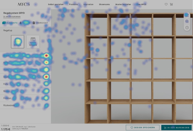
- A glance at overall heatmap confirmed that
- 1. User were using the side navigation.
- 2. No rage clicks
- 3. Every result was as per expectation
Version 2
After the success of version 1, we started working on reducing the number of clicks.
We introduced an onboarding system as well as a notification system to help the user get comfortable with the configurator. We merged multiple things which include Color and Elements options which saved us about 4 clicks.
Impact & Conclusion
- • Over all the project was a success.
- • The customer engagement time increased from 20 seconds to 75 seconds.
- • Conversion rate went up approx 30%.
- • Instant drop offs were reduced by 15%.
- • Number of repeat customers was increased.
Lesson
- • Not every redesign needs a major logic change.
- • Educating the customer is very necessary.
- • You have to incentivise the customer to make the sale fast.
- • Reducing friction in the experience goes a long way and increases the time of customer spent on website.
Good Design is Good Business 🙂